
No-code development platform that enables users to design and build applications for any media needs.
My Role
UX/UI Designer
Project
Enhance the UX
DURATION
Four Weeks
As a UX/UI designer, my responsibilities include working closely with the product team to identify user problems, communicating design recommendations, prioritising outcomes, and managing expectations across dev teams.
Pluxbox is a no-code development platform that enables users to design and build highly-personalised applications for any media needs.
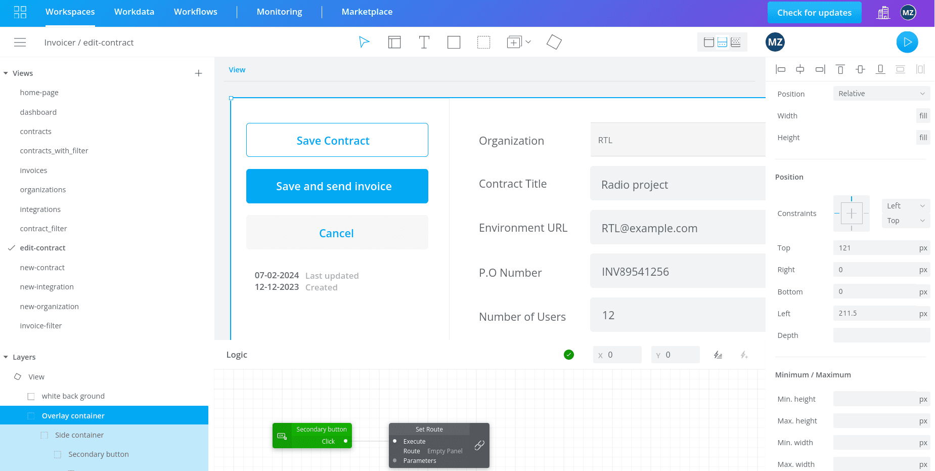
The Pluxbox platform consists of three main interfaces: Workspace, Workdata, and Workflow. Within the Workspace, users begin by designing the user interface (UI) of their application in the Artboard View. Once the UI is created, they can switch to the Logic View, where they add functionality by connecting logic blocks.
Problem Breakdown
Through continuous feedback from the Discord community and user research, it became evident that a large number of users were struggling with the platform's design environment and tools. This was particularly concerning given the platform's value proposition of being a no-code solution. If users cannot efficiently use the design tools, the platform’s fundamental mission is compromised.
Design Process
How we noticed?
The first signs of a problem came through customer support channels, where users frequently expressed frustration with the design tools. I started by conducting usability testing to clearly define the issues. From there, I developed solutions based on the challenges identified. In the final stages, I prioritised the most effective approaches and measured their impact.
Usability Testing
To identify pain points and limitations in our design environment, I planned and conducted a usability test with 5 users. 2 of them were already Pluxbox customers and the other 3 were new to the platform but had experience with other design tools.
Since the survey is old, to assess this result ourselves, we created a short quiz and asked 20 people questions regarding the extent of information they share online. Our emphasis was on widely-used platforms like Netflix and Amazon, where people routinely interact. We found out most participants were surprised by the result. For example they had no idea Amazon has their voice and their face through speaking to Alexa or images collected from Amazon services. At this point we assumed that most people don't realize how much data they
share every day.
(NB: Due to constraints such as time and budget, I limited this research. However, with more resources, it would be beneficial to conduct this research across different segments of users (For example designers, developers, …), with 4-6 usability sessions per segment until data saturation is achieved.)


Not all issues discovered during usability testing were equally important so I needed to categories the problems based on the severity of the issues identified which is a combination of 4 factors:
1-The frequency with which the problem occurs
2-The impact of the problem: Will it be easy or difficult for the users to overcome?
3-The persistence of the problem: Is it a one-time problem that users can overcome once they know about it or will users repeatedly be bothered by the problem?
4-The market impact of the problem (since certain usability problems can have a devastating effect on the popularity of a product, even if they are "objectively" quite easy to overcome)
According to this, I categorised the usability issues based on 4 severity levels:

Lack of color setting
When the user uses the container tool, they are not able to choose the color and only by adding the rectangle tool they can have a color.

zoom in/out issue
while zooming in, the size of the columns on the left and right side also changes and it limits user's actions

Component issues
components would appear in a separate page, pre-made component are not editable and it is not possible to search component by image.


Limited space
On each page, there is a white board in the middle of the work environment. All the actions are limited to this white board

Direction of the layers
To bring an element to the topmost layer in the left column, instead of bringing it up, users should bring it down which does not align with their real life mental model.


Color palette issue
Having two columns of color (As light color and dark color) is confusing for users.

Summery of findings
I created these charts to visualise the most important findings from previous research.

Impact-Effect Matrix
In collaboration with the PM, we prioritised problems based on their importance, frequency of occurrence, and development costs.

For the first phase, the team focused on the high impact/ low effort actions:
We added a background setting to the container element
We fixed the zoom in/ out function, enabled preview for all pages and enabled moving of elements by keyboard arrows.
Improve the user experience of working with components
High Fedility Prototype
Click on the image to access Figma prototype.


