Carbon
Footprint

Carbon
Footprint

An application designed to help users understand and reduce the carbon footprint of their smartphones.

CLIENT

Fairphone

SERVICES

UX and UI design

DURATION

Five Weeks

In the modern digital age, where connectivity is ubiquitous and smartphones have become indispensable tools in our daily lives, the environmental impact of technology usage cannot be ignored. 

Problem and Solution

Problem and Solution

Problem and Solution

The Netherlands heavily depends on grid power for energy needs, with a mix of renewables and fossil fuels. Energy efficiency and reducing carbon emissions are crucial, even in smartphone usage due to the internet's energy consumption. Data centers supporting online activities demand a lot of energy, making the environmental impact of internet use a concern. Smartphones, though small, contribute to energy consumption from manufacturing to disposal. The Carbon Footprint app tackles these challenges by helping users use their phones more sustainably.

Process

Our journey began with thorough research aimed at understanding how smartphone usage intersects with environmental awareness. We crafted a survey to gather insights from users, focusing on awareness of carbon emissions, behavior patterns, and sustainability preferences:


  • How familiar are you with the concept of carbon emissions associated with smartphone usage?

  • Do you actively try to reduce your carbon footprint?

  • How long have you been using a Fairphone?

  • What motivated you to choose a Fairphone over other smartphone brands?

  • How often do you use your smartphone on a typical day?

  • Which activities do you use your smartphone for the most (e.g., calls, messaging, social media, browsing)?

  • How important is sustainability to you when choosing a smartphone?

  • Are you willing to make changes to your smartphone usage habits to reduce your carbon footprint?

Concept Development

our aim was to turn insights into practical ideas. We brainstormed and tested different concepts, focusing on making them user-friendly and effective. We kept refining our ideas based on feedback until we had a solution that seamlessly blended sustainability with everyday smartphone use.

Sketching

Initial sketches were created to help Ideation and conceptualize the layout and flow of the application.

From Paper to Digital

Dashboard: The dashboard offers users an overview of their CO2 budget, the active Eco mode, and a graphical representation of their overall carbon footprint over the course of a year. By clicking on "See your budget," users can access and adjust their current budget preferences. 

Action Page: This page allows users to take proactive steps to reduce their carbon footprint by implementing eco-friendly settings, such as activating Eco mode or adjusting device settings manually. 

Analytics Page: The analytics page offers detailed insights into the carbon footprint of users' smartphone usage, including breakdowns by activity and time period. Visual representations help users identify areas where they can optimize their behavior to minimize environmental impact. 

Usability Testing

Usability testing played a crucial role in refining the application, leading to significant improvements that enhanced user experience and clarity. Here are the most important iterations based on the usability testing:

1- Firstly, I learned that the analytics page was confusing for users. They had trouble understanding how battery and internet are contributing to CO2 emissions, so I split it into two separate cards - one for battery and one for internet usage with some explanation instead of showing them in the same graph . This made it easier for users to understand.  

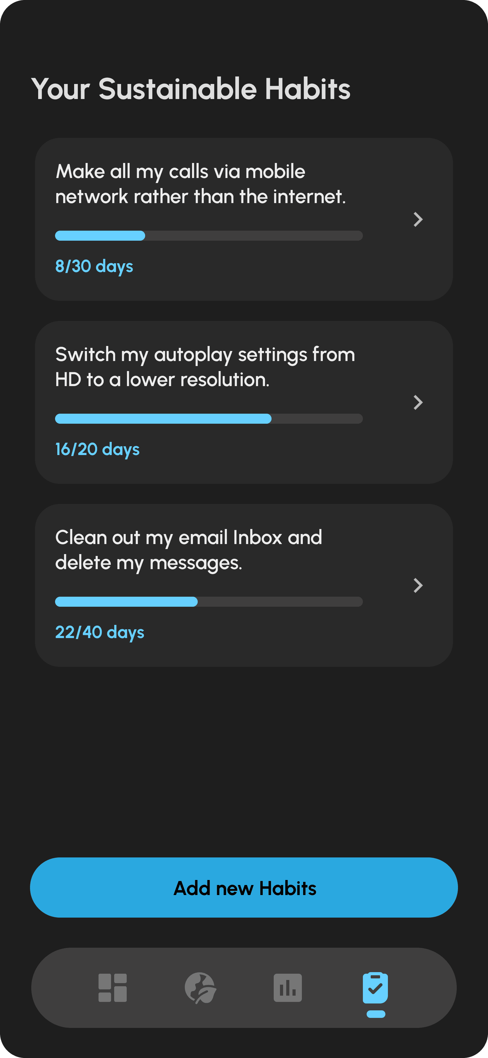
2- Secondly, I found that the graph on the dashboard wasn't useful for users because the numbers will not change that much every month, so I replaced it with a section where users can set and track their sustainability goals. I also added a new page dedicated to setting these goals. 

3- Lastly, users needed a clearer reference for their CO2 budget, so I added a scale to show acceptable CO2 limits and made this abstract amount more tangible by adding the car ride equivalent and the "Bigger picture".

High Fedility Prototype

Click on the image to access Figma prototype.

DIGITAL DESIGN

With Me

Maryam.zlfr@gmail.com

DIGITAL DESIGN

Maryam.zlfr@gmail.com

DIGITAL DESIGN

With Me

Maryam.zlfr@gmail.com