Designing an app to reduce the carbon footprint of phone usage for Fairphone.

Context
While it's nearly impossible to stay away from our smartphones, we often wish to use them less but find it difficult. Smartphone operating systems help by showing our weekly or monthly usage. The effects extend beyond just users; the production and use of smartphones contribute to CO2 emissions in various ways. Fairphone, a company that strives to produce sustainable mobile phones by increasing the longevity of its products, is taking further steps. We aim to establish a sustainable relationship with our phones while using them.
Problem
How can we establish a new connection within our phones to decrease our carbon footprint from phone usage and enhance sustainability?
Process
To gain a better understanding of the issue, we conducted a comprehensive literature review.

Emissions related to the life cycle of a product or a service:
The main emissions occur during the production and exploitation of raw materials, which Fairphone addresses by increasing the longevity of their phones.

How using our phones connected to the environment?
By using electricity and the internet. But how exactly is using the internet connected to the environment? What happens when we open our Gmail or go to Microsoft Teams? Each of these elements is individually powered by electricity
Benchmarking applications relates to the topic:
Exploring sustainability apps, we found features like carbon budgets, optimal charging times, and personalized usage. These apps use gamification with points and badges to engage users. We also examined Android Well-being, which tracks screen time and includes focus, sleep, and work modes.
Stakeholder (Fairphone) interview

We learned about their goal, their user spectrum and characteristics of each group.
One important key takeaway from this session was that their users got infantilized by their previous attempt to use gamification in one of their in-house applications.To their dark-green audience, sustainability is not a game and this felt as oversimplified and downplayed to them.
Remote knowledge game

We invited a few users to play a game. To assess the general level of awareness among Fairphone users. participants' task involved dragging and dropping stickers into categories representing the estimated CO2 impact (low, medium, high). The results revealed that although participants had some level of knowledge, it was not entirely accurate, and there were still some topics unknown to them.
Research in Fairphone community
We crafted a survey and posted it in the Fairphone online community to gather insights from users, focusing on awareness of carbon emissions, behaviour patterns, and sustainability preferences.

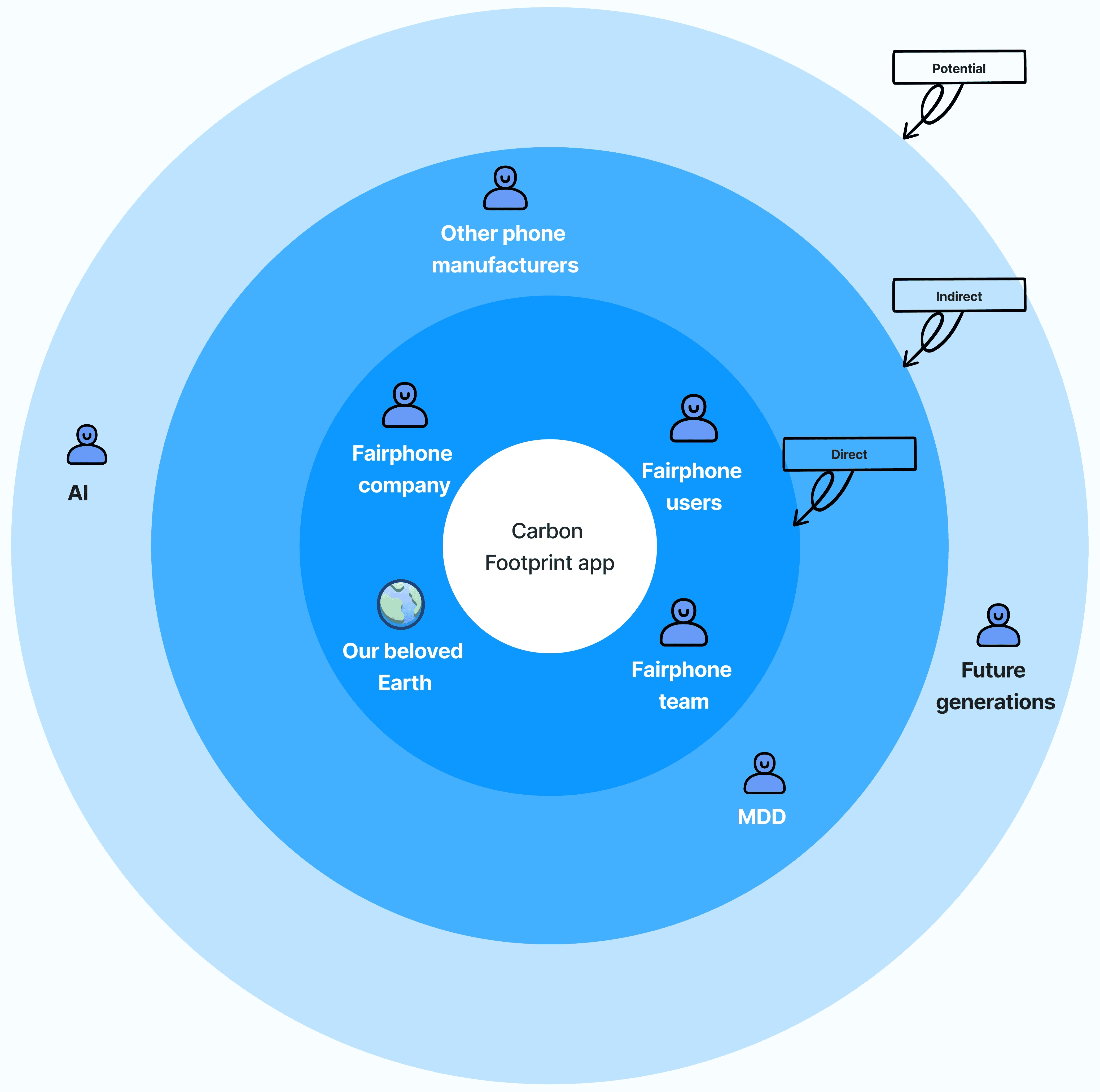
Stakeholder Map
Concept development
We made detailed wireframes to bring our ideas to life.
Idea 1 - Budget-set up view and reports
A feature offering detailed graphs and statistics on the user's digital habits, emphasizing their environmental impact.
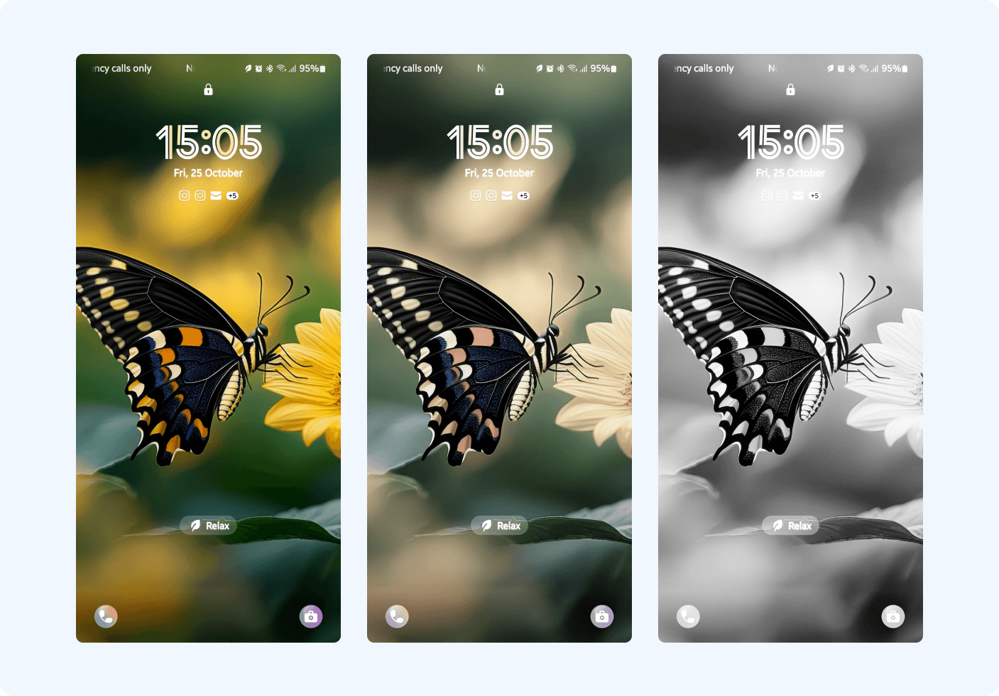
Idea 2 - Dynamic Home Screen Wallpaper
This wallpaper visually depletes as phone usage increases, serving as a subtle reminder to reduce screen time.
Idea 3 - App restriction
Apps turn to black and white and you can not use more apps by ending your budget
Idea 4 - Eco Mode
An Eco mode that helps you to reduce your carbon footprint by applying some settings and limitations to your phone

Prototype
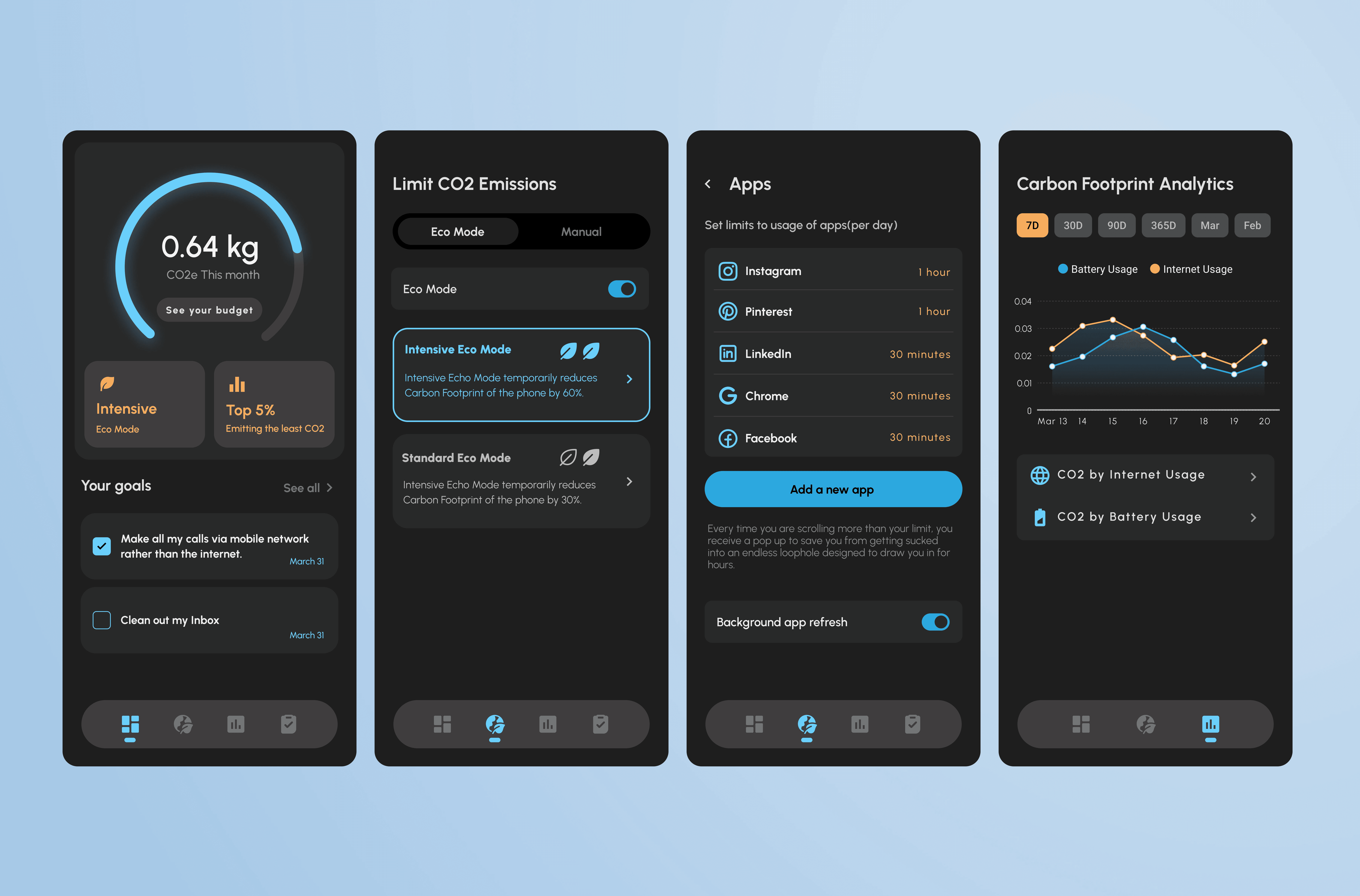
The dashboard: The dashboard displays users' CO2 budget, active Eco mode, and a yearly carbon footprint graph. Users can click "Set your budget" to view and adjust their preferences. To make the CO2 amount less abstract, we translated it to a more tangible metric like car ride or flights.


Action Page: This page allows users to take proactive steps to reduce their carbon footprint by implementing eco-friendly settings, such as activating Eco mode or adjusting device settings manually.


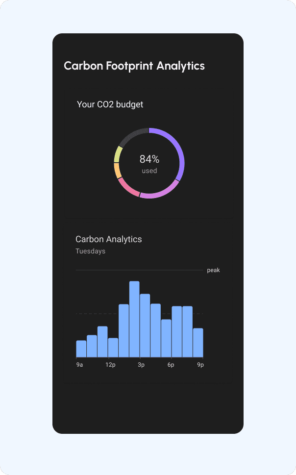
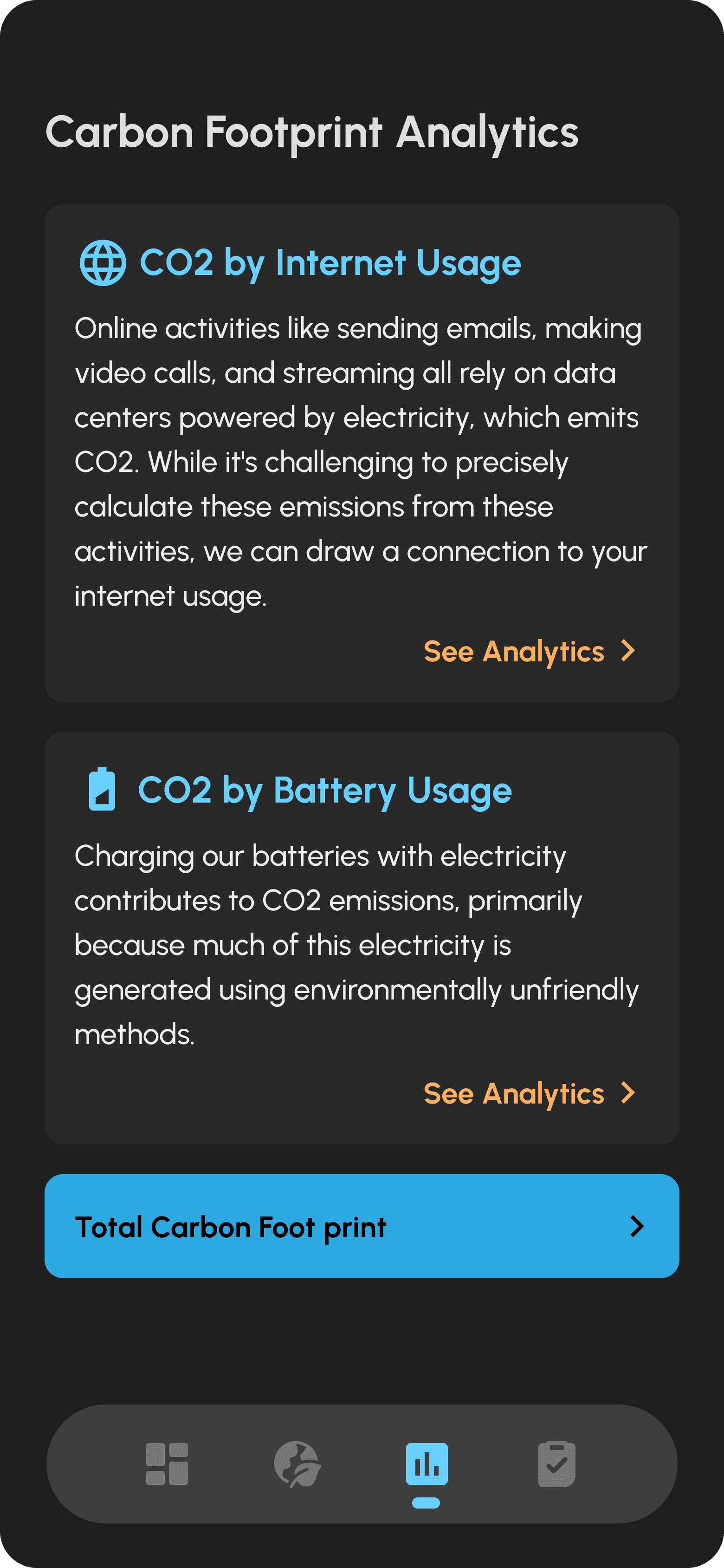
Analytics Page: The analytics page offers detailed insights into the carbon footprint of users' smartphone usage, including breakdowns by activity and time period. Visual representations help users identify areas where they can optimize their behavior to minimize environmental impact.


Usability test and new challenges
We tested prototypes with users in the usability lab of hva. Here is the result:
The general feedback was positive and attendees expressed great interest in the small interventions designed for different scenarios. We had three main challenges:
Firstly, I learned that the analytics page was confusing for users. They had trouble understanding how the battery and the internet are contributing to CO2 emissions, so I split it into two separate cards - one for battery and one for internet usage with some explanation instead of showing them in the same graph.
This helped simplify user understanding, but we quickly realised the heavy text made the design boring. To address this, I proposed a solution: designing cards with embedded graphs for a more engaging experience!

Challenge 2
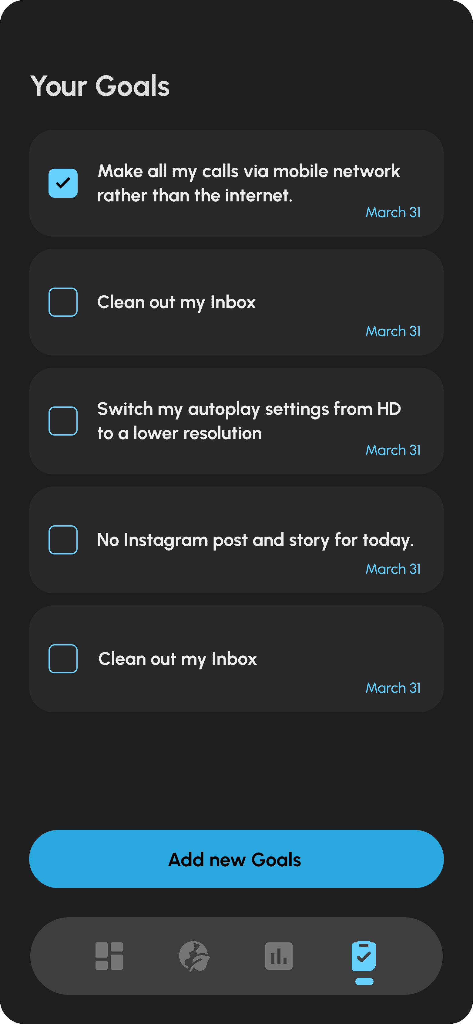
Secondly, I found that the graph on the dashboard wasn't useful for users because the numbers will not change that much every month, so I replaced it with a section where users can set and track their sustainability goals. I also added a new page dedicated to setting these goals.
This iteration was crucial for Fairphone business, as we needed to encourage regular user engagement with the app, rather than having it function like a one-time setting that users adjust and then forget about.
Anchoring Bias:
Users rely heavily on the first piece of information they see.

Spark Effect:
Users are more likely to take action when the effort is small.
Challenge 3
One of the key insights from user testing was the need for a clearer reference point regarding their CO2 budget. Initially, we displayed the impact of an individual user. However, we quickly realised that this approach felt insignificant to users—it seemed like their personal contribution didn’t make much of a difference.
To address this, we shifted to a broader perspective by showing the collective impact if everyone in Europe adopted the same CO2 budget. While this framed the issue on a larger scale, it backfired: users felt overwhelmed by the massive number and believed their individual actions didn't matter!
So we came up with the idea of combining the impact of one user and a group of people. This allowed users to see how their personal choices connect to a larger effort, reinforcing the message: “My actions really do make a difference!”

Framing:
The way information is presented affects how users make decisions.
Reactance:
Users are less likely to adopt a behavior when they feel forced.
Future refinements
After presenting our design concepts to Fairphone, we received valuable feedback that led to further iterations
1-We learned that accurately getting CO2 amounts is challenging and that overwhelming users with too much information can lead to negative feelings. Instead of focusing on precise figures, we were suggested to adopt a more general perspective, emphasizing overall trends rather than exact numbers.
2-We realized that users feel uncomfortable with reminders that focused on negative aspects of their CO2 footprint. To address this, we decided to shift our strategy to focus on positive reinforcement rather than criticism.
High Fedility Prototype
Next projects

Pluxbox UX improvement
Improving the usability of Pluxbox no-code platform
