Designing an app to make data sharing activities transparent
Overview
In an increasingly interconnected world, where technology is an integral part of daily life, concerns about digital privacy have become more pronounced. Instead of treating us like individuals, many of us are seen as data points stored in computers and our control over this digitized existence is limited!
Problem and Solution
This project centers on enhancing data transparency within the municipality of Amsterdam. Currently, residents who apply for allowances, are required to provide extensive personal
information, not all of which is essential. Our objective is to create awareness among applicants regarding the utilization of their data. We seek to clarify which organizations or third
parties have access to their data, when and for how long.
Framing
When your data privacy is breached, it can lead to serious problems like identity theft and financial fraud. To help you understand why it's so important to be cautious with your data online, we made a video:
Link to the video
Process
Research
The 2016 survey of 900 participants from five countries that was conducted by Morey and Forbath, highlighted that only 25% of respondents, on average, were aware that their data footprints included location information, and merely 14% understood that they were sharing their web-browsing history.
Since the survey is old, to assess this result ourselves, we created a short quiz and asked 20 people questions regarding the extent of information they share online. We found out most participants were surprised by the result. For example they had no idea Amazon has their voice and their face through speaking to Alexa or images collected from Amazon services.


Survey
Recognizing the need for further exploration, we started a more in-depth investigation. We made a survey and gave it to 45 students to learn more about the allowances they get from the Amsterdam municipality, what data they share, and if they know how it's used.
The results showed that none of them really know how their data is used, and half of them never even read privacy policies. This means they have no idea who has their data, for how long, or why.

Ideation
After talking with experts we realized something new: instead of just raising awareness, we should make life easier for people. We were told a significant number of residents in the Netherlands are unaware of the various allowances they are eligible for. Recognizing this, we understand that helping people requires not only making them aware but also finding effective ways to showcase all the potential benefits available to them. That's why we came up with the idea for the "Guardians Vault" app.


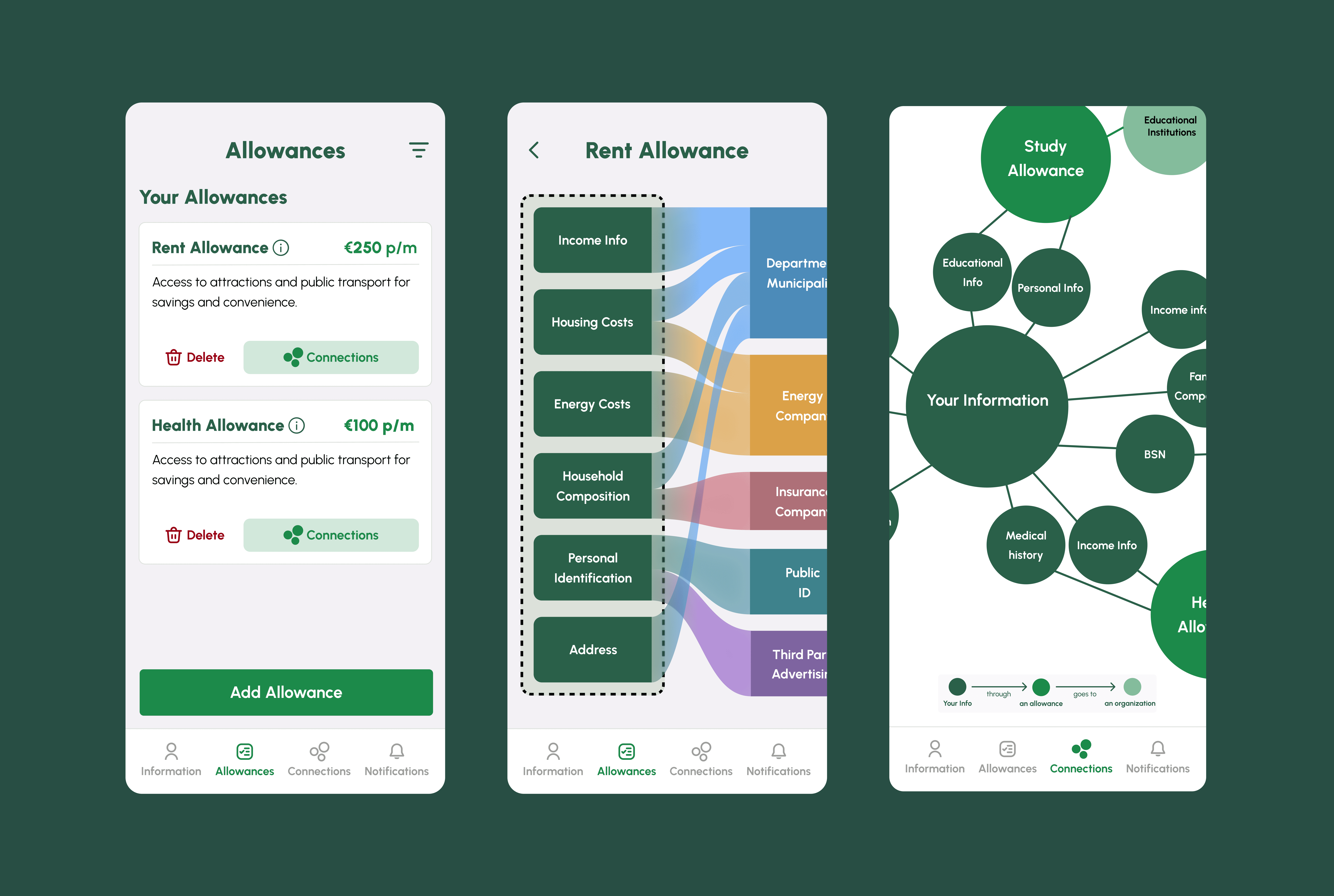
Our application acts as a secure vault, empowering users to keep their data safe. Users have the flexibility to choose which specific data they feel comfortable sharing. Based on these preferences, they are presented with a comprehensive list of available allowances on a separate page. In this allowances section, they also see other allowances that they are eligible to apply for, but this time they need to provide more data.

We have designed another page that vividly illustrates the types of organizations that have access to their data in a Sankey diagram. By clicking on the "Connections" feature associated with a particular allowance, users are redirected to this page.

The studies show that oftentimes information disclosures describing personal data-gathering are so poorly designed, In response, we have introduced a dedicated section that visualize how all the user’s data (from all the allowances) is being shared and used by a network visualization.
Usability Testing
I tested our prototype with 10 Amsterdam residents. I tried to understand:
-If the data visualization as the most important part is efficient enough to raise awareness.
-If people feel their data is safe through this application.
-If there is any problem with information architecture, user flow and UI elements.

What did I learn from usability testing?
1) Our data visualization is too complicated, making it hard for people to understand how their data is used, which is our main goal. (more details in the table)
2) There are some UX challenges due to confusing app bar bottom and complexity of some pages. People cannot complete difficult tasks.
3) There are some UI problems related to hierarchy, colors, contrast and visual elements.
Consequently, my attention was directed towards enhancing these aspects of the application, with a primary emphasis on data visualization. I delved deeper into the conventions of data visualization to ensure a more effective implementation.
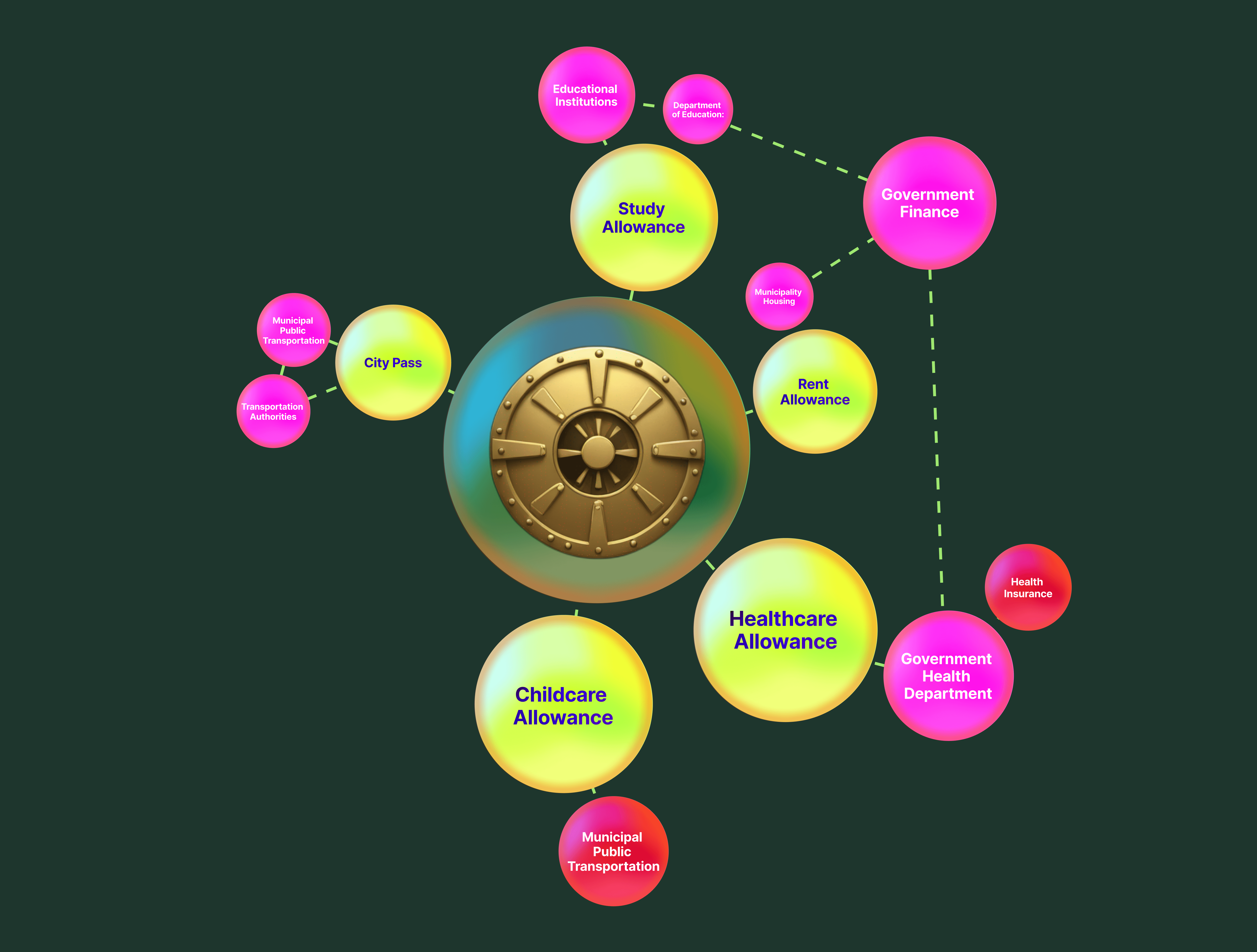
Enhancements in data visualization derived from usability testing:
1-The nature of data sent to each organization has become apparent.
2-Participant confusion caused by unrelated colors was addressed by implementing a consistent green color scheme, with distinct shades for each category.
3-The range of color green from dark to light also shows that how your data is being sent to organizations step by step.
4- I provided an small guidance to help users understand the visualization.

Major UI improvements based on usability testing:
1-Corner radius
I adopted corner radius at lower pixels for the buttons and cards to bring seriousness and stability to our interface.


2-Improvement of app bar bottom
The usability testing result showed that the old app bar bottom is confusing for most participants. So I made it more understandable.


3-Placement and hierarchy of buttons
Based on material design system, multiple button types can be used to express different emphasis levels but we can’t use two contained buttons next to one another if they don’t have the same fill color.


4-Text breathing room and hierarchy


5-Simplicity


6-Improving data visualization

What I learnt?
In my journey of working with evidence-based design, I have made significant progress by experimenting with various methods to validate design decisions. Initially, I relied on desk
research, surveys and interviews as primary sources of evidence. As I progressed in my project, I incorporated usability testing and user behavior analysis to gain deeper insights into user interactions with our design.
Through my recent project, I learnt that by crafting prototypes, I can gain lots of valuable feedback about the usability of my design, satisfaction and errors. Moving forward, I intend to implement more iterative making and testing throughout the design process
High Fedility Prototype

Next projects

Pluxbox Logic Blocks
Designing a new feature to improve user experience of working with logic blocks.
