Designing a new feature to save time when creating logics
About Pluxbox
Pluxbox is a no-code development platform that enables users to design and develop applications for any media needs.
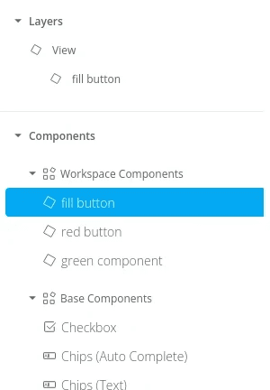
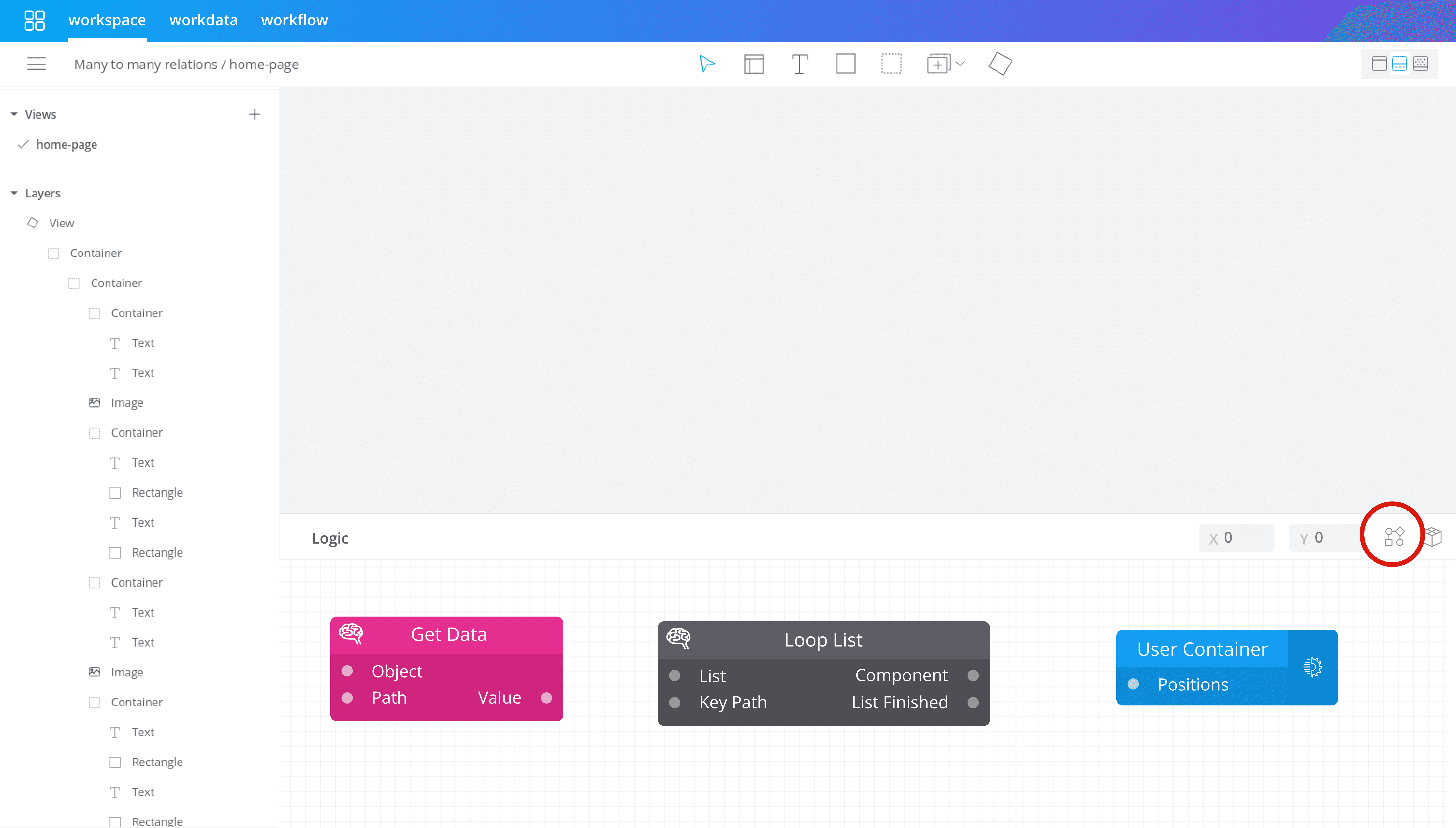
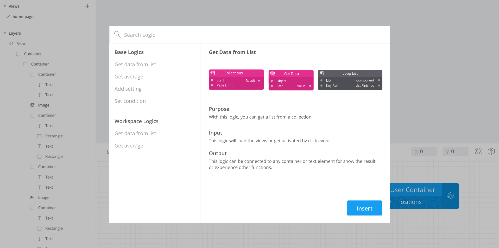
Within the Workspace, users begin by designing the user interface (UI) of their application in the Artboard view. Once the UI is created, they can switch to the logic view, where they add functionality by connecting logic blocks.
Problem and Overview
During our analysis of user behaviour, we noticed that users take longer than expected to create events using logic blocks. This is often because they have to repeat the same actions over and over again, which adds to their frustration and slows down their progress.
Also, users sometimes face errors or can't achieve their desired results, and because they can't understand why, they abandon the task in frustration. These issues go against the platform’s promise of being an easy, no-code solution. Addressing these problems is key to improving user experience, increasing platform adoption, and reducing user drop-off.

Process
User research
To better understand user challenges, I decided to record 5 users' screens with their permission. (due to Pluxbox’s dynamic elements like logic blocks and layers, Clarity can't fully capture real-time changes users were making.) These screen recordings allowed me to observe how users interacted with the logic creation process, helping us identify why tasks took longer and where users encountered errors. These observations gave us a clearer understanding of what was causing their frustrations:
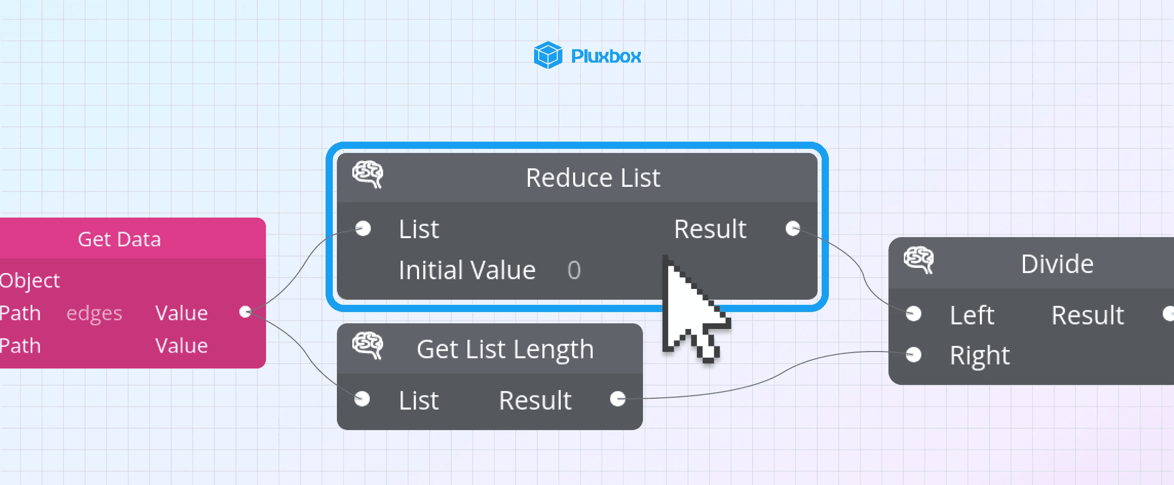
1) The "Loop list" block and the "Reduce list" block can be double clicked and users have to go inside them to add more blocks. But there is no UI element to show that they are clickable and this leads to errors while making logic.
2) Users often faced challenges during their interactions due to selecting wrong blocks.

User Interview
To complement our understanding, I decided to conduct interviews with same users to grasp their frustrations and pain points. The insights from the interview are:
-Interviewees mentioned that they often need to repeatedly use certain logic blocks because they work together. This repetition leads to frustration and increases the time required to complete their tasks.
-Users highlighted the difficulty in navigating the logic creation process. They felt overwhelmed by the number of options available and struggled to understand how to connect blocks effectively.
-They reported that the documentation sometimes was insufficient for their needs.
-They noted that identifying the cause of errors is challenging due to insufficient feedback.
Severity-impact matrix
I prioritized the problems identified through a severity-impact matrix.

Problems and Ideation
According to the findings from previous research, I focused on two main problems and ideate solutions:
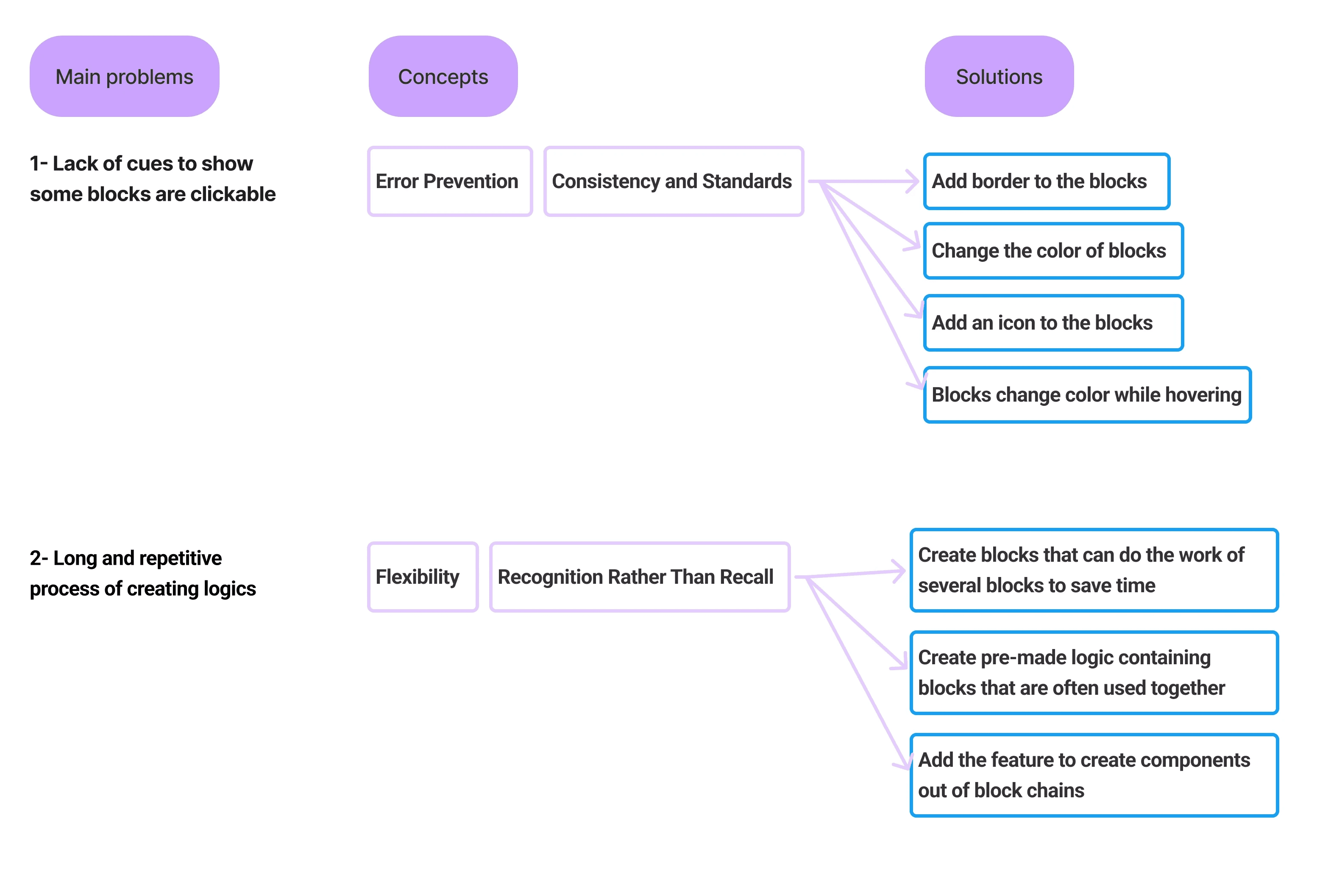
How can we make it clearer to users that certain blocks are clickable?
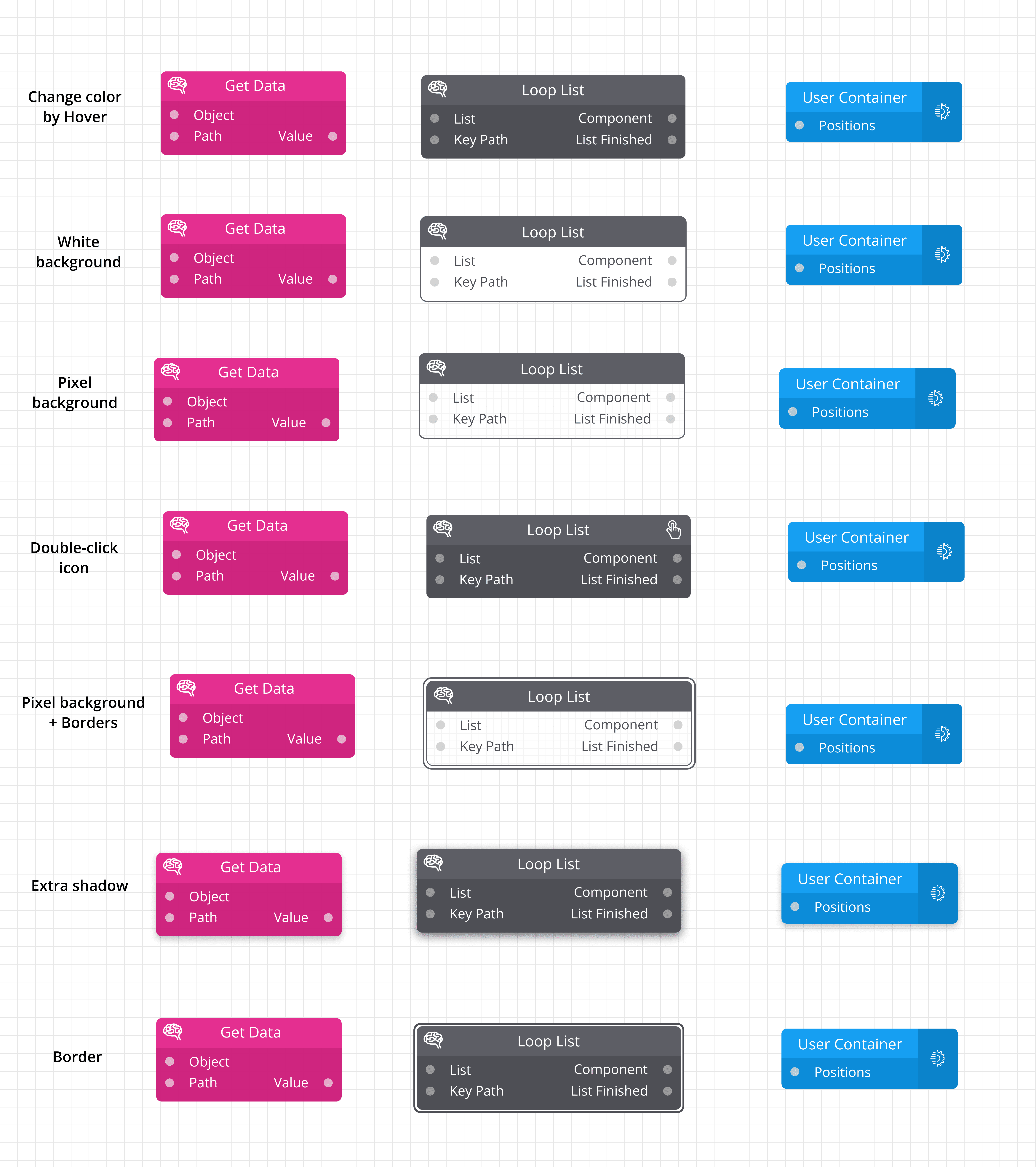
I began by quickly designing multiple potential solutions. Next, I conducted A/B testing to determine the most effective UI improvement.

A/B Testing
1)Hypothesis and metrics
If we enhance the visual cues for clickable blocks by adding borders, changing their background color on hover, and incorporating icons, the Click-Through Rate (CTR) will increase, leading to less user errors.
2)User testing
I designed variants with improved visual cues based on the chart and asked 6 users to interact with them, providing feedback on which ones they recognized as clickable.

Next, I evaluated the two winning options and I selected the “Pixel background block” solution. While the alternative choice would maintain consistency with other blocks in the same group by keeping the background color gray, I wanted to ensure the best user experience not the best UI. So, to finalize my decision, I conducted an additional test with 2 users, which confirmed that users need to easily find which blocks are clickable in the overview, especially when there are many blocks displayed.

How can we streamline the repetitive process of creating logics?
Idea 1 (Discarded): Create blocks that can do the work of several blocks to save time
It will be confusing for users to distinguish between regular blocks and parent blocks.
Each category of blocks have a specific color and there will be a challenge to choose color for them.
For some blocks user have to choose a path or a number or a collection so this solution is challenging.

Idea 2 (Discarded): Add the feature to create components out of block chains just like design elements
While this feature benefits experienced users familiar with logic creation, it doesn't provide much value to new users.
Users have to remember the logics by name which is not user friendly.
Idea 3 (Approved): Create pre-made logic containing blocks that are often used together
This solution supports both new and experienced users.
To use this feature, users follow the same journey as choosing a block.
They have the option to use default sets or create their own, providing flexibility and convenience.
A new section for pre-made logics has been introduced, allowing users to access default groups of blocks or create their own sets. With a drag-and-drop functionality, users can insert multiple blocks simultaneously, significantly accelerating the no-code development process.
Outcomes
Changing the interface of the "loop list" block and "reduce list" block, resulted in a 20% reduce in error rate for users while creating logics.
The feature of pre-made logics has not yet been implemented in the platform. However, testing the final prototype with 5 users showed a significant reduction in the time spent creating logics.
Next projects

Pluxbox user experience
Improving the user experience of the Pluxbox design environment.
