Freelance
App

User experience design for UX design for a freelancing App.

CLIENT

Couse Project

SERVICES

UX and UI design

DURATION

Four Weeks

"Freelancing is a serious business."

There are many talented people in the world who find it difficult to make money with their skills(painting, graphic designing, video editing,...). My job is to create a platform where freelancers can easily find projects.

Problem and Solution

Looking for projects can be a serious challenge for freelancers. As they don't have a permanent job, lack of projects means lack of money. On the other hand clients aren't able to find experts easily. So we created an application where freelancers and clients connect to each other.  
Process

Learning about the users
I took the initiative to conduct a series of user experience research to gain more information about freelancer's problem. The research involves an online survey and many interviews.

I then took the responses through a card sorting exercise to find common patterns among the participants.

Major insights


1. Unfair pricing problem

Overall, the participants didn't have a positive experience in similar websites due to unfair pricing mostly caused by junior freelancers.


2. Limited interaction with clients

One of the biggest problem in similar platforms is that the interaction between freelancers and clients is so limited, therefore, freelancers aren't able to get enough information.

3. Payment challenge

The current platforms don't provide the participants a safe contract where the payment dates and deadlines are clear.

4. Comments and rating

Most participants find rating so useful as it both help clients and themselves.

5. Teamwork

Overall, the participants want the application to provide them a space to work on projects as a team.

Persona

I incorporated the insights into the user persona and then designed the user flow.

User Flow

Paper First

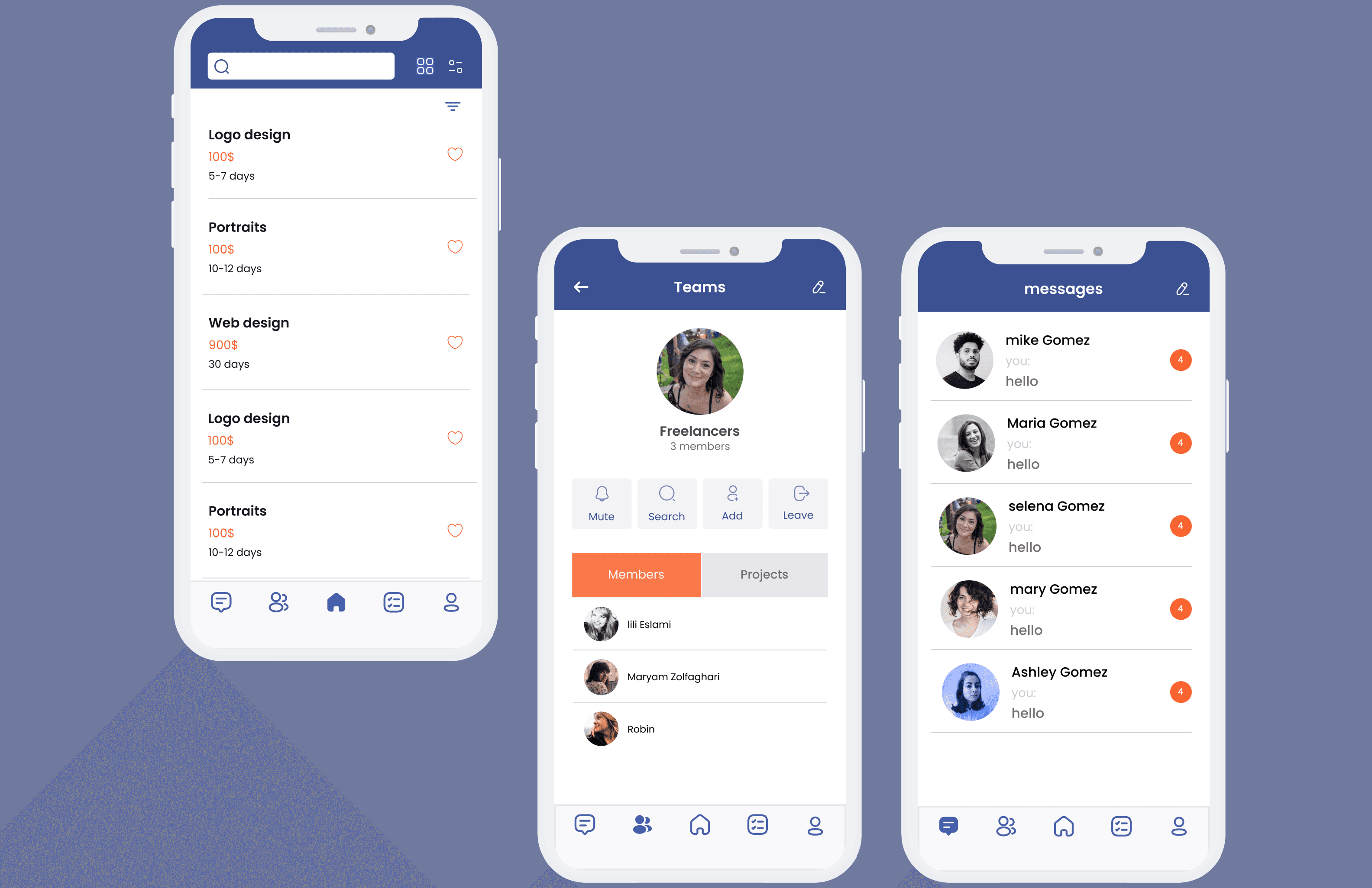
In this wireframes, you can see how I tried to solve the user's needs. In the homepage, users can find a list of projects with their price and their deadline. They can also use filters to narrow them down. After they choose a project, they receive more information and decide to request that project. Then, they check their request page to see if the client has accepted their request. 

From Paper to Digital

I then brought my idea to an interactive digital low-fidelity wireframes and then moved to a high-fidelity prototype. As you see, I also made a chat page for freelancers to talk to clients and a page for teams to do group projects.

On the other hand, clients can choose freelancers by their rating, comments or portfolio.

What I learnt?

I did this project with my two UX classmates so I learned about teamwork and design critique. In fact, More different opinions lead to a better result because we want to make sure that the problem is completely solved. I also learned how to make useful feedback and how to take other's feedback to improve my work.

High Fedility Prototype

Click on the image to access Figma prototype.

DIGITAL DESIGN

With Me

Maryam.zlfr@gmail.com

DIGITAL DESIGN

Maryam.zlfr@gmail.com

DIGITAL DESIGN

With Me

Maryam.zlfr@gmail.com